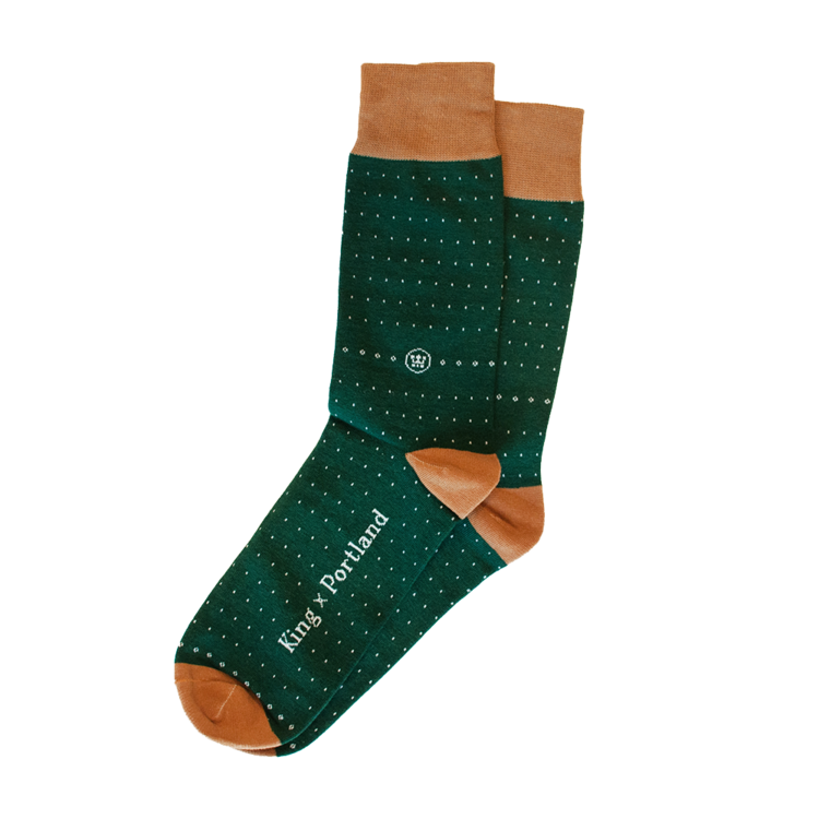
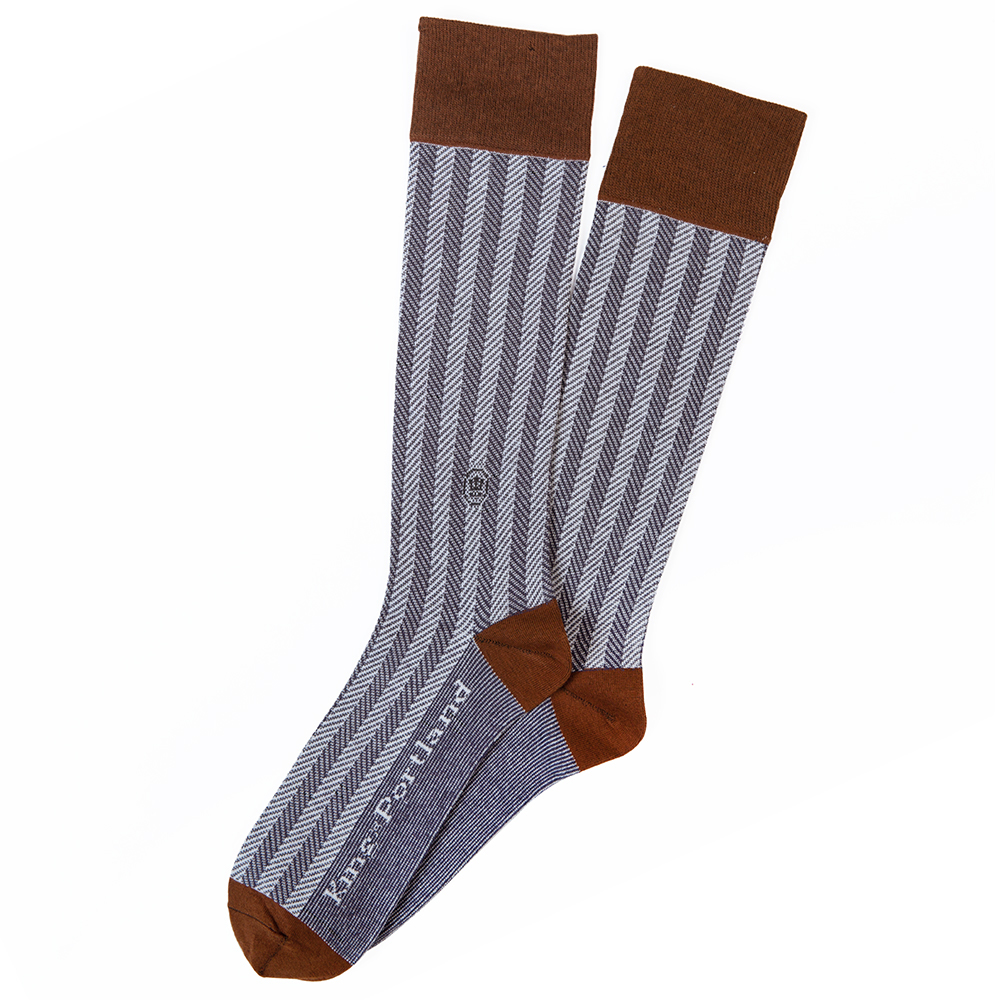
king × portland
LOGO + SUBCRIPTION WEBSITE
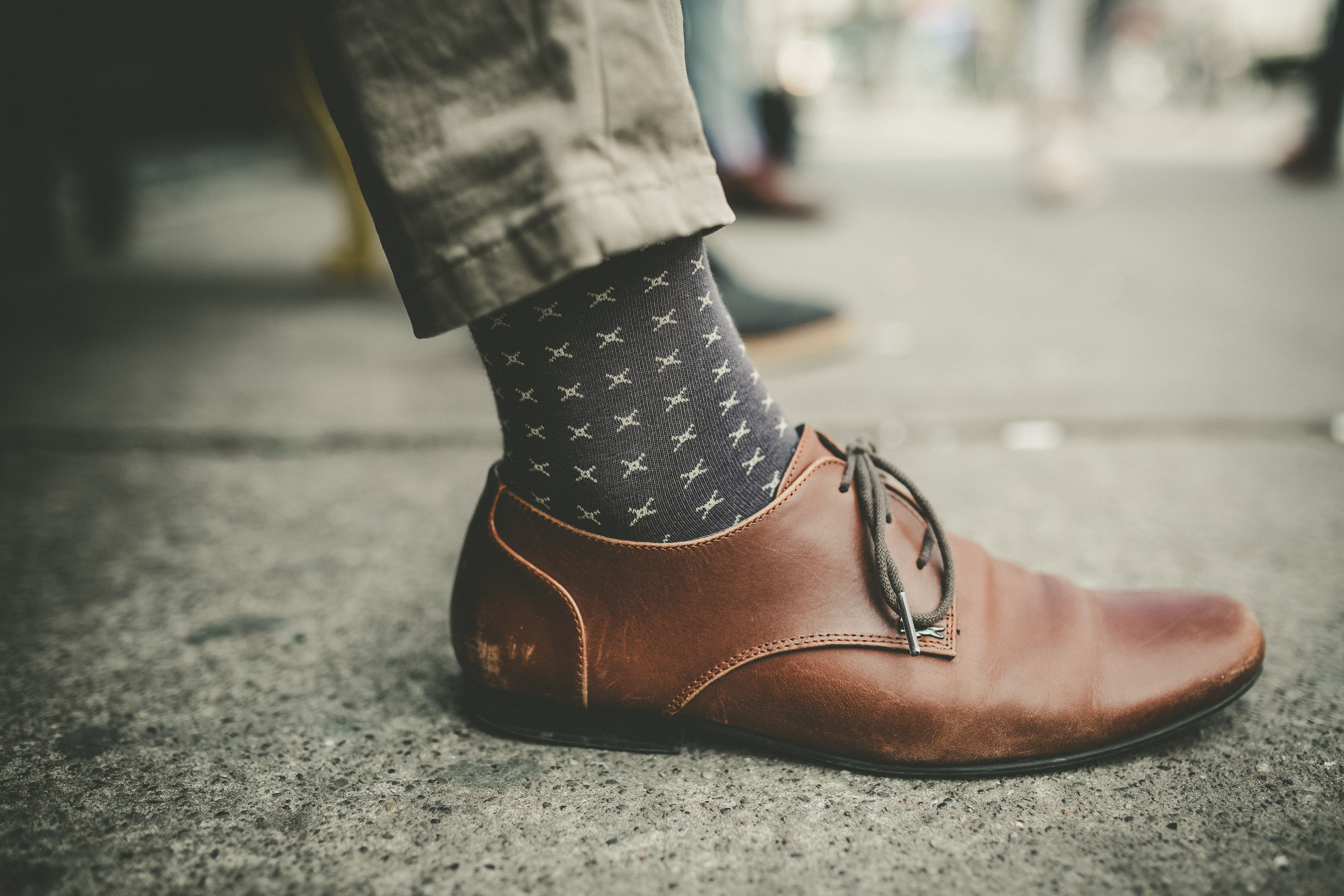
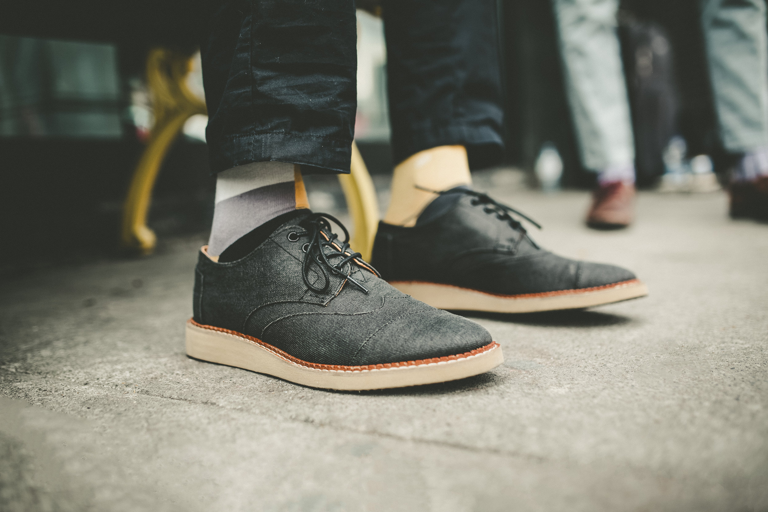
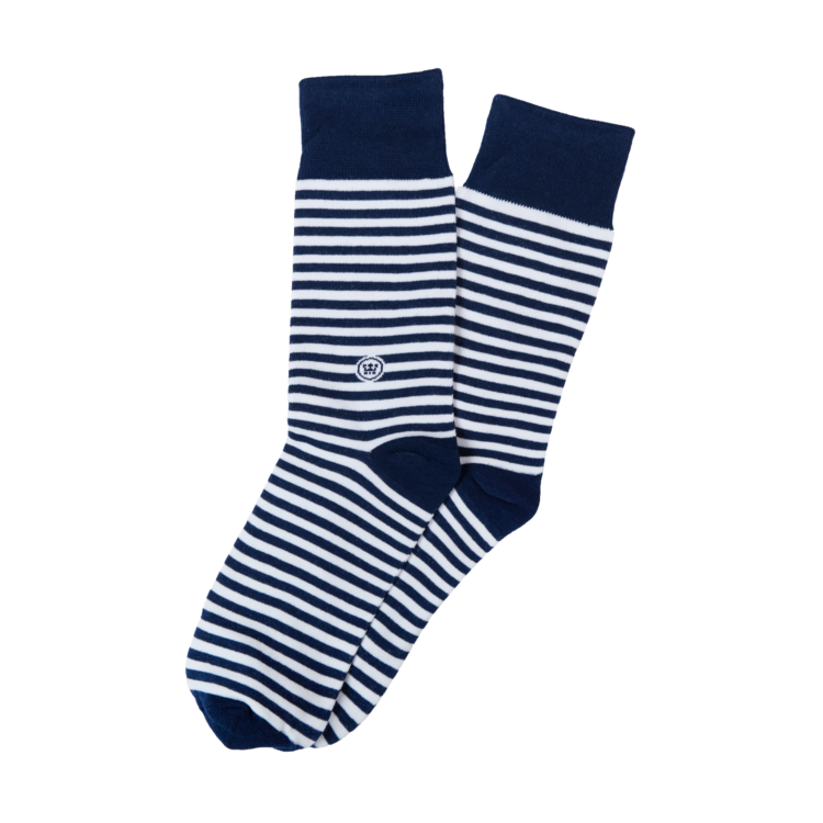
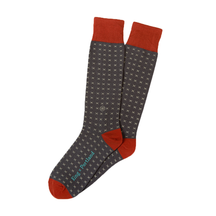
The logo crafted for this Toronto based subscription sock company was directly inspired by the meaning behind it's name. The crest itself shape and crown topper are a nod to a royal coat of arms (king) and the carefully crafted ship and brand colours are inspired by shipping ports (portland). The muted, high contrast, shallow depth of field give the lifestyle photographs a edge that appeals to the Toronto urbanite.